
Making Figures for Proposals: My Current Strategies
Over the past few years, I’ve been actively working on diversifying my funding sources, which means I’ve been writing a lot of proposals. And while I’ve gotten better at structuring my ideas and tailoring my writing to different calls, there’s one aspect of proposal writing that still doesn’t come easily to me: making figures.
I’ve always found it easier to write than to draw. But proposals increasingly demand well-structured, visually appealing figures that can communicate the big picture at a glance. Reviewers are busy, and a good figure can make the difference between understanding your idea immediately or missing its relevance altogether.
So although it’s a challenge, I’ve started developing a few standard types of figures that I now include in most of my proposals. Having these templates in mind has made the process feel a bit more manageable—even if the execution still takes time and effort.
Here’s what I’m currently doing for my proposal figures:
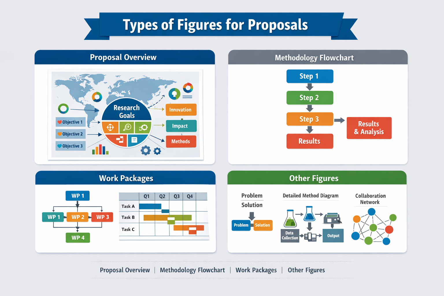
- A high-level infographic of the entire proposal
This is my most ambitious figure. I try to bring together the big picture of the proposal into one visual: a map of the consortium, the main pillars or themes of the proposal, and how everything ties together. This figure often takes the longest to design, but it helps both me and the reviewers to see the overall coherence of the work. It is also where I put the color palette for the proposal to work. - A flowchart of the methodology
This is a more classic figure showing how the research steps follow one another. I use it to outline the experimental process, data analysis pipeline, or general logic of the study. It’s a familiar type of figure for most reviewers and helps them quickly grasp the workflow. - Work packages as a flowchart or Gantt chart
For multi-year or collaborative projects, I typically include a visual breakdown of the work packages. I use a flowchart to show dependencies, a Gantt-style chart to communicate the timeline, and a Pert chart to show the critical path. This helps demonstrate feasibility and project management. - Other supporting figures
Depending on the topic, I may include:- A problem–solution visual to show the research gap and how my project addresses it.
- A detailed diagram of the methodology, especially if it’s novel or has multiple components.
- A partnership or consortium diagram for collaborative proposals showing how we contribute to the different parts of the methodology.
I’ll admit that I’m still learning how to design figures that are both visually appealing and informative. But I’ve found that just having a mental checklist of the types of figures to include helps me structure my thinking and reduces the overwhelm. When in doubt, I start with a rough sketch on paper, then iterate digitally.
In conclusion, making figures for proposals might never be my favorite task—but it’s a skill I’ve had to develop as part of growing into a more versatile researcher. With every proposal, I learn a bit more about what works and what doesn’t. And having a few go-to figure types definitely helps lighten the load.